Hi there, this is Johan. I'm a designer working on the design system for Smart from Belgium.
With this blog post I'd like to give an update on Smart's open design system, and more specifically on the new Figma library that we just released.
Usage
We're happy to hear that different Smart organisations across Europe have started using the design system, but we haven't heard much chatter on GitHub issues. Feel free to post new issues. Don't be afraid to start a new issue, and just talk about what you want — as long as it's related to the design system we are happy to discuss your comments, thoughts or ideas.
Updated Figma files
When we released the design system about 2 months ago we released the code and the Figma designs at the same time. We tagged the design files with “1.0” in Figma whereas the code does not have a specific versioning scheme at the moment.
We've been designing new screens and iterated on the design files for the past two months, but those files were under wraps up until now. Today we released the update on our Figma community profile. You can find it here.
One change is that the screen designs and the library are in the same file, so that components are linked together. This was not the case with the initial release.
Once again, if you have any comments, feel free to voice them on GitHub issues.
What has changed?
A design system is always in flux. You can see the development changelog here. The design changelog lives inside the Figma library file. New designs inform what happens on development and vice versa.
Overall, most changes followed the creation of new types of screens.
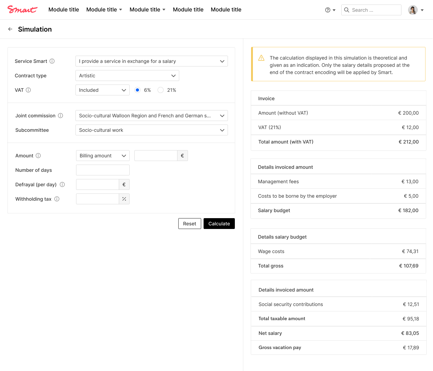
For example, for a compensation simulation tool, we created a left/right layout where the left side of the screens contains a form and the right side contains a result. You can view the template of said page here.
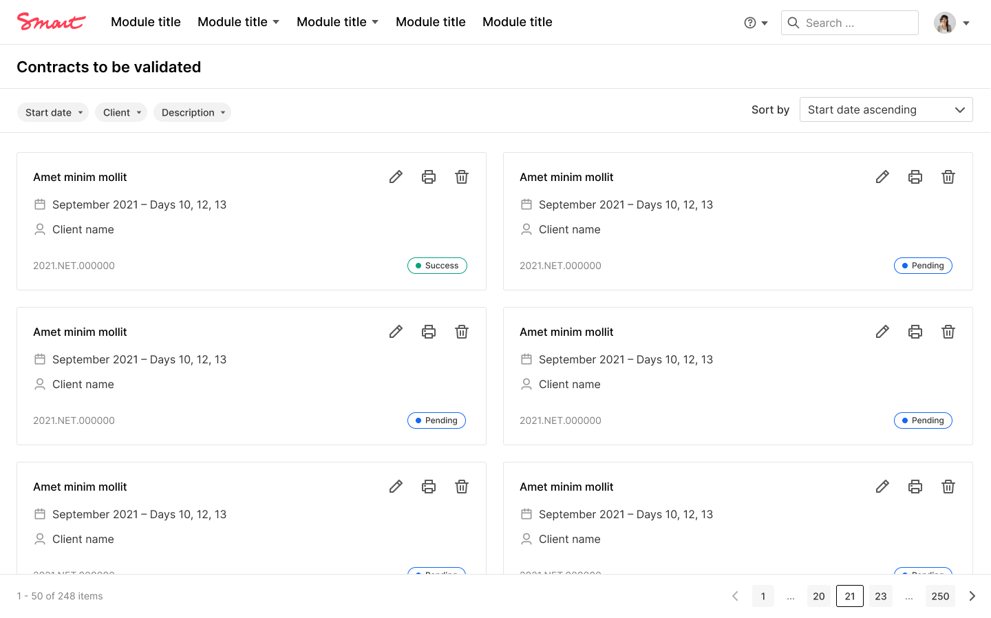
Another example is a card list, which has instigated some discussions about what would be the best solution for this type of view. As you can see in the implementation, we have resorted to a single column for now to make it easier to scan the page.
If you look closely in the newly released design files, we are also working on screens that display a sort of public profile for an application related to trainings and courses.
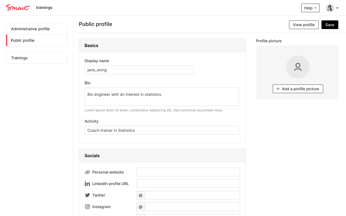
These mockups inform new components, such as changes to the side navigation or the addition of a rich text component in Figma (which we don’t have an implementation for yet).
Wrapping up
We hope that by publicly talking about our design work, we can inspire other Smart organisations — and others in general — to improve their front-end and design work.
As noted, once again, feel free to leave a GitHub issue - whether it's about the design files or the development. We really want to start a conversation to make this the best system possible.
Written by
-
Wolfr
